What is Web accessibility?
The purpose of creating websites is that they can generate traffic toward themselves by way of being accessible and informative for everyone. The chances of your website ranking better and attracting more visitors depend on ease of use, engaging and informative content, and appealing visual appearance. UI and UX are gaining more importance and traction with every passing day.
A crucial parameter to consider when creating a website is Web accessibility compliance. Being web-accessible compliant means removing the barriers to comprehension and usability of a website for all people, including ones with disabilities.
Over 15% of the world’s population is disabled, according to The World Bank. These may consist of:
- Visual impairments: Some people experience visual impairments that limit their capacity to discern color contrasts or see well.
- Deafness and partial hearing loss are examples of hearing impairments.
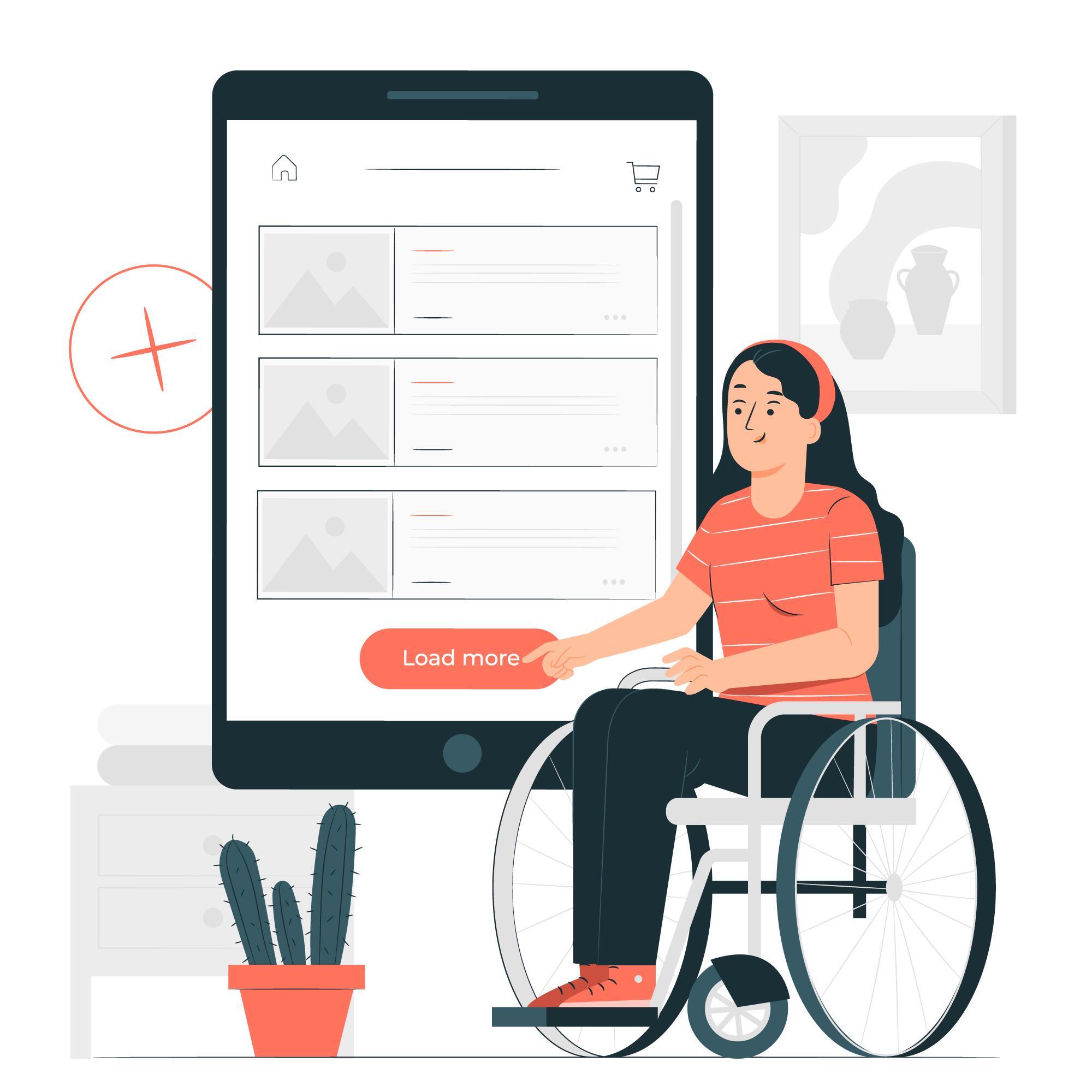
- Physical impairments: Some persons have problems moving about that may affect their skill and ability to make accurate motions, which could make using a mouse challenging.
- Cognitive impairments: Diseases like dementia and dyslexia can impair a person’s cognitive functioning.
A well-made and web-accessible compliant website addresses issues and difficulties faced by differently-abled people and design websites that enable easy use and navigation of the website for one and all.
The World Wide Web Consortium has formulated a set of guidelines to ensure and encourage websites to become web-accessible. Adhering to these guidelines makes your website ADA compliant.
What are the Web accessibility guidelines?
The foundation of WCAG consists of four key accessibility guiding principles. POUR, which stands for Perceivable, Operable, Understood, and Robust, refers to these four concepts. One of the POUR principles can be used to characterize many of the technical difficulties that handicapped persons and people with disabilities confront.
Perceivable:
Indicates that a user can recognize content and UI components using their senses. This indicates that many users predominantly perceive a system visually, yet perceivability may also depend on sound or touch for other users.
Examples of Perceivable problems
1. The links that make up a website’s navigation are typically presented in various sequences from page to page. How can a user travel through the website efficiently if he/she has to master the basics of navigation again for every page?
2. There are some non-English terms and phrases in a Word document. How can assistive technology properly render the text if the languages are not indicated?
Perceivable solutions:
1. Text Replacements
Any non-text content should have alternatives to convert it into formats that users may need, such as big print, braille, speech, symbols, or plainer language.
2. Temporal Media
Offer substitutes for time-based media.
3. Adaptable
Create content that may be shown in various ways (for instance, a simplified layout) without losing its structure or information.
4. Distinguishable
Create simpler content for users to see and hear, distinguishing foreground from background, for example.
Operable:
Indicates that a user can use buttons, controls, navigation, and other interactive components effectively. This entails using assistive technology, such as speech recognition, keyboards, screen readers, etc., for many users.
Examples of Opeable issues:
1. A user unable to operate a normal mouse will not be able to view web information that requires a mouse.
2. People with poor or no eyesight also rely upon the keyboard’s functionality. They may have no trouble using a mouse, but since they can’t see where to click on the screen, it doesn’t help them much. For a blind individual, using the keyboard is significantly simpler.
Operable Solutions:
1. Keyboard Compatibility
Make the keyboard the exclusive interface for all functionality.
One of the most crucial Web accessibility concepts is keyboard accessibility because it applies to all types of disabilities and technological advancements.
2. Adequate time
Allow people sufficient time to read and utilize the content.
3. Seizures
Avoid creating content that is known to trigger seizures.
4. Navigable
Provide means for users to navigate, locate content, and ascertain their location.
Understandable:
Users should understand the information and pick up on using your OER site. Your OER should have a consistent presentation and structure, predictable usage patterns, and a voice and tone acceptable to the target audience.
Examples of problems that are clear:
1. The links that make up a website’s navigation are typically presented in various sequences from page to page. People with disabilities cannot efficiently navigate your OER if they have to relearn basic navigation on every page.
2. A website frequently uses jargon, acronyms, and abbreviations. Users with disabilities (and others) cannot understand the material if these terms are not defined.
Understandable solutions:
1. Readable
Make text content readable and understandable.
2. Predictable
Make Web pages appear and operate in predictable ways.
3. Input Assistance
Help users avoid and correct mistakes.
Robust:
To give users the freedom to choose the technology they use to interact with websites, online documents, multimedia, and other information formats, content must be strong enough to be reliably interpreted by many users. Users’ tools to access OER content should be completely up to them.
Robust problem examples:
- You must have a particular web browser version to use a website’s functionality. A person cannot experience the site’s functionality if they cannot utilize that browser.
- A screen reader on a specific operating system cannot view a document format. Users can view the document if they use that OS for routine tasks.
Robust solutions:
Increase compatibility with all user agents, including present and future assistive technology.
Tips to make your website web-accessible:
1. Select a content management system (CMS) with accessibility features.
A variety of CMS is available to assist you in creating your website. WordPress and Drupal are common examples.
After selecting a CMS that meets your needs, be careful to select an accessible theme or template. Go to the theme’s documentation for accessibility-related advice and pointers on developing accessible content and layouts for that theme. Use the same criteria for choosing widgets, plugins, or modules.
Make sure components like video players and editing toolbars allow the creation of accessible content. For instance, editing toolbars must offer accessible tables and headings options, and video players should support closed captioning. The CMS management tools should be available, like those for writing blog posts or leaving comments.
2. To properly organize the structure of your text, use headings.
Screen reader users can use the header structure to traverse the text. Your website’s content will be properly arranged and understandable to screen readers if headings (and another formatting) are used appropriately and strategically.
Use the proper heading sequence carefully, and use CSS to separate the presentation from the structure (Cascading Style Sheets). Instead of choosing a header based solely on how it appears on the surface (which can confuse users of screen readers), design your text using a new CSS class.
Examples of how to utilize headings correctly:
- Utilize the page’s main title. Aside from the title of the website and the titles of individual pages, refrain from using an <H1> anywhere else.
- Use headers to denote and organize the structure of your content.
- Avoid skipping heading levels (for instance, moving from an h1 to an h3) since screen reader users may believe the material is missing.
3. Add accurate alt text to your photographs.
For screen reader users to grasp the message sent by the usage of images on the page, alt text for images should be provided. This is crucial for informational visuals in particular (such as infographics). If an image has text, that text should also be included in the alt text, which should contain the message you want to express through that image.
The one exception to this rule is when an image is used only for decoration; in this instance, the alt text can be left empty (the link is external) so that the screen reader user is not diverted from the page’s more significant information.
If a link’s only content is an image, the screen reader will read the image’s file name if no alt text is present. Always include alt text when using images as links.
4. Name your links in a distinctive and evocative manner.
When incorporating links in your article, use wording that accurately represents the link’s destination. The phrase “click here” is inefficient for screen reader users and is not regarded as descriptive.
Visually impaired people can use their screen readers to search for links just way sighted users do when they scan a page for linked text. As a result, users of screen readers frequently fail to read the link in light of the remainder of the page. The context of links is correctly explained to screen reader users using descriptive language.
Since screen reader users frequently scan the links list using the initial letter, the most distinctive content of the link should be given first.
- As an illustration, if you direct people to a page titled “About Us.”
- The phrase “Click here to read about our company” should be avoided. Instead, add, “Read About Us to discover more about our organization.”
5. Use color sensibly:
About 8% of the population suffers from red-green color deficiency, the most prevalent type. These people won’t be able to interpret your message if you only use these colors (particularly to denote required fields in a form).
When utilized to identify and arrange your material, color has significant advantages for users with learning difficulties and other disability groups.
Use color to appeal to audiences, but include other visual cues like an asterisk or question mark. Make sure to use visual separation to separate content blocks from one another (such as whitespace or borders).
You can use various tools to assess color contrast, which will help you make your page as visually accessible as possible to people with impaired vision or different degrees of color blindness.
6. Create forms that are accessible.
The screen reader user does not have the same indications as the sighted user when form fields are not properly labeled. The kind of information that has to be entered into a form field could be impossible to determine.
Your form should contain labels for each field that are strategically placed and descriptive. For instance, if a person’s name is in the field, it should be suitably labeled as either “Full Name” or divided into two separate fields with the labels “First Name” and “Last Name.” To link the label text to the form field, use the tag or an ARIA property (see tip #9).
A person should be able to tab through the form and fill out every field before reaching the “Submit” button; otherwise, they might not even be aware that there are extra fields. The tab order should follow the visual order.
Consider utilizing fieldsets to organize related or similar fields if you have any. For instance, “Personal Information” could include fields like “Full Name” and “Date of Birth.” A screen reader user can keep track of their progress and get the context they might be missing while filling out the form by using this sort of form organization.
If a form field has to be filled out, it should be identified and set up to notify screen reader users. Some screen readers will not speak the asterisk, a common way to indicate that a field is necessary. For visually impaired individuals, those with learning difficulties, and those who speak English as a second language, asterisks (or comparable visual cues) should still be utilized. ARIA required=” true” and ARIA required=”false” can tell a screen reader if a field is mandatory or optional. The user must be informed of the submission confirmation and any problems after submitting the form.
We advise mentioning any error numbers in the page title (after the user submits) so that the user is immediately alerted that the page contains mistakes. When a user submits a form with mistakes, they should be directed to a submission page that details the errors and offers a quick path.
Finally, CAPTCHA is difficult to use and not a good submission validation option. The internet contains a handy list of accessible CAPTCHA substitutes to prevent spam submissions to forms.
7. Do not use tables for layout; only for tabular data.
Users of screen readers see more verbosity when pages are laid out using tables. Screen readers notify users that there is a table with an “x” number of columns and rows whenever they come across one, which detracts from the content. Additionally, the text’s reading order could differ from how the page appears visually. Instead of utilizing tables to lay out a website, utilize CSS for appearance.
Use headers for rows and columns to help explain the relationships between cells when a data table is required (i.e., when you have a set of data that is best comprehended in a table format, such as a bank statement).
Use the “scope” attribute in HTML to identify any complex tables that contain several cells that relate to one another in a certain way. HTML5 table captions can provide users with more details about how to read and comprehend the relationships between the tables.
8. Ensure that all content may be logically accessed using only a keyboard.
It’s possible that people with mobility issues, such as those who have sustained repetitive stress injuries, cannot operate a mouse or trackpad. These users can access content by pressing the “tab” or “arrow” keys on a keyboard or using alternate input methods like a single switch or a mouth stick. The tab order should correspond to the visual order, so keyboard-only visitors can properly browse the site’s content.
Anchor links (jump lists) should be used to break up long pages with a lot of content, so keyboard-only users can move directly to the relevant parts of the page without having to navigate through other content. Each page should contain a “Skip to main content” link at the top, so keyboard-only users won’t have to tab through the page navigation to access the main content.
All menu items on sites with local menus with several levels and sub-items should be accessed using the keyboard. Avoid using elements that can only be activated by the user hovering over them with the mouse because users of keyboard-only devices or screen readers won’t be able to do so.
9. Use ARIA landmarks and roles ( when necessary).
An intricate and effective technological definition called ARIA (Accessible Rich Internet Applications) is used to add accessibility information to elements that are not already accessible. When they are accessible, you should always use native HTML components. Remember that the first ARIA guideline is: “Don’t utilize ARIA.” ARIA characteristics are no longer required for many tasks thanks to HTML5.
For instance:
- Instead of using the ARIA role of the button, use the standard HTML button tag.
- Instead of using an ARIA label, use the HTML label tag.
- Instead of using the ARIA navigation role, use the HTML 5 nav tag.
- You can add ARIA attributes to your HTML the same way you add classes to HTML to load CSS attributes.
10. Make interactive content available.
Screen readers might not be aware when content changes dynamically (i.e., without refreshing the website). This covers popups, lightboxes, in-page changes, modal dialogues, and screen overlays. Page overlays may entrap people who solely use their keyboards. Users of magnifying software can zoom in on the incorrect portion of the page.
It is simple to make these features accessible. Options include front-end development frameworks that assist accessibility and ARIA roles and alerts.
Make sure video players can be used with a keyboard and don’t auto-play (non-consensual sound). All videos must also offer alternatives for closed captioning and transcripts for hard-of-hearing viewers.
If your website features a slideshow, ensure that the keyboard can be used to move through each image and has alt text. Make careful to test for accessibility if you are utilizing any special widgets (such as a calendar picker or drag-and-drops).
For more information and services on website enhancements,